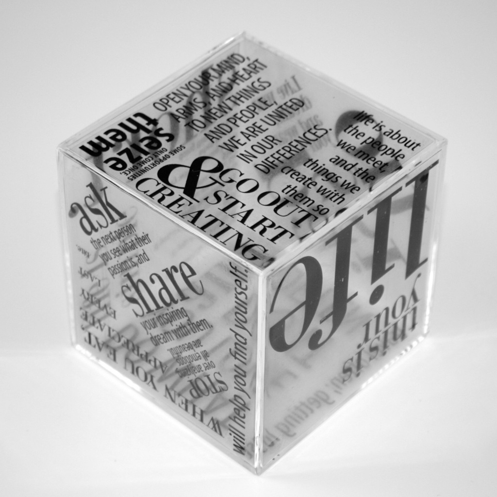
Using a poem, song lyrics, story exempt or any body of copy, our third final project of typography class was to incorporate that with making a 3d object expressive. In this case, it was a clear cube. This pushed us to think of type beyond being a form of communication, but as symbols for expression.
To create a side to appear darker than the others, the kerning of the words can be tighter, and the opposite to create a more open space.
The hardest part of this project was creating a flow and allowing each phrase to stand on their own.
This was one of my favorite projects from last semester and I keep it on my desk. The copy I chose is from The Holstee Manifesto. This manifesto was a great inspiration for me when I was debating between continuing on with a job and career I wasn't happy or passionate about, or taking a risk and going for a BFA in Graphic Design.
If you've ever felt stuck or dissatisfied with what you're doing, but you're fearful of change, I recommend you get this manifesto, hang it up and look at it everyday. Then, set out a plan and go for it.


